[ ux ] · UX designer · 1 month
bedtribe ux redesign
UX redesign of Bedtribe’s website to improve the landing experience and align with user needs through research and wireframing.
Bedtribe website ↗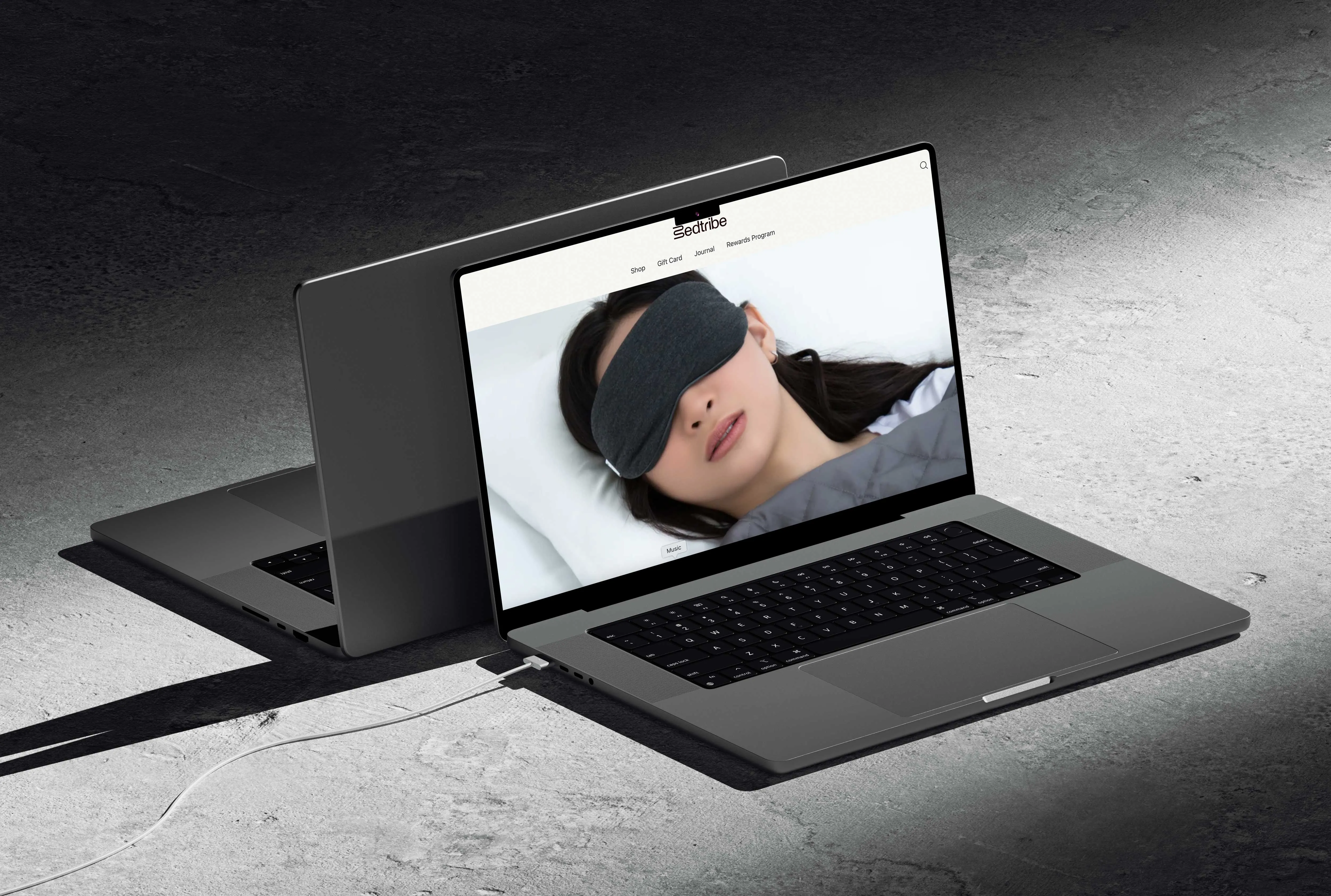
[ background ]
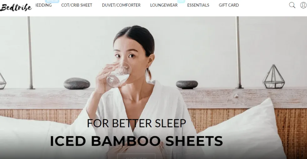
Revamping Bedtribe’s website to reflect its brand values of comfort
Bedtribe is a homegrown Singapore bedding company known for affordable, hotel-quality sheets and sleep essentials. As the brand grew, there was a clear opportunity to elevate its digital presence and streamline online shopping.
The goal was a website that reflects Bedtribe’s values of comfort, simplicity and modernity while fixing usability pain points. The UX work covered a full redesign of the information architecture, user flows and product discovery journey to improve conversion and retention.
[ process ]
Uncovering what shoppers want in bedsheets
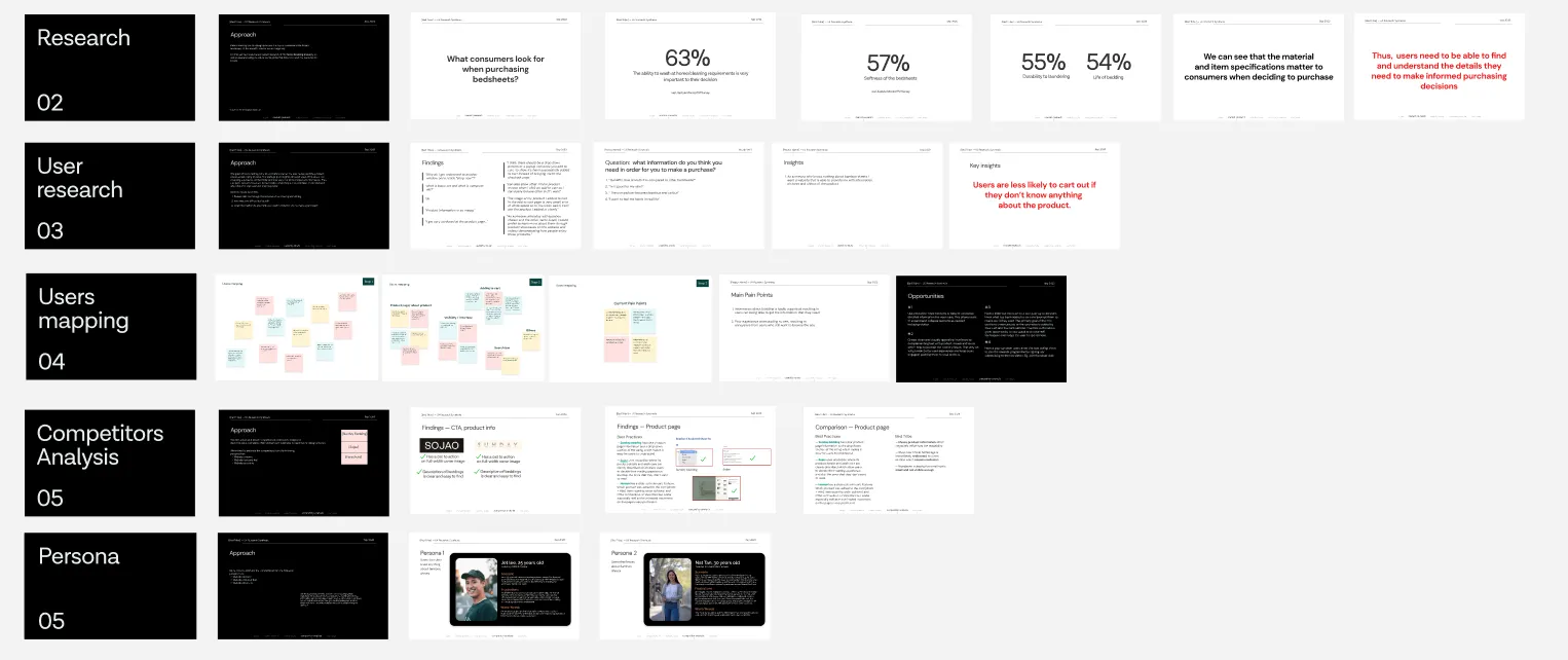
Before redesigning anything, I did secondary research into the motivations, concerns and decision-making factors behind buying bedsheets.
It gave me a view of the wider home-bedding market and current trends, and of what shoppers really care about: material quality, breathability, price and easy care. That showed what information users need up front to feel confident buying.
[ secondary research ]
Material and specifications matter
Shoppers put strong emphasis on understanding material quality, thread count, breathability and care instructions before buying. These details shape how they judge comfort, durability and value.
- 63%
- say washing at home and cleaning requirements are very important to their decision
- 57%
- say the softness of the bedding matters (Lifestyle Monitor™ Survey)
So shoppers need to easily find and understand the details behind a confident purchase
[ usability testing ]
Testing the current website to understand the problem space
Usability testing showed what users think of shopping on Bedtribe and how easy it is to find important information: which content is memorable, what feels important, and their own ideas for improvement.
[ affinity mapping ]
Clustering insights to define design opportunities
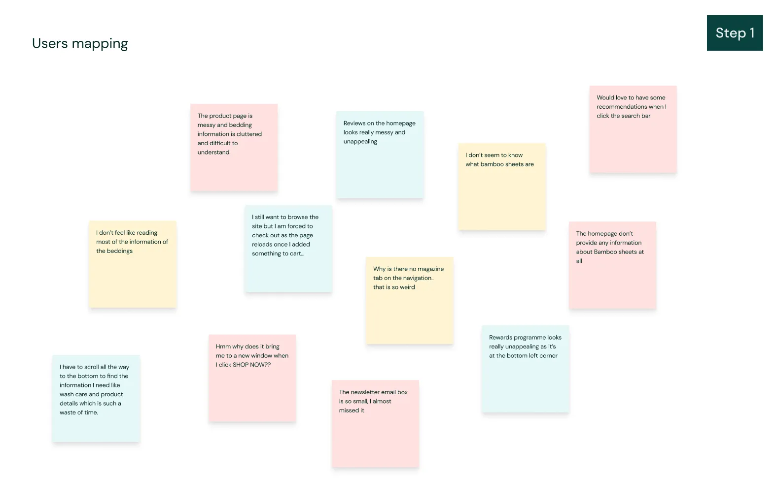
To make sense of the qualitative data, we grouped feedback and observations into common themes to see what users struggled with or paid attention to.
[ key insights ]
These insights drove which features came first
- [1]Users are less likely to check out if they don’t know anything about the product
- [2]Product education (materials, feel, usage) needs to surface earlier in the shopping experience
[ design opportunity ]
Use accordion sections or tabs to condense detailed information like wash care, so users can expand what they need without the page feeling cluttered.
[ sitemap ]
Structuring content and features around the insights
[ wireframes ]
The first round of wireframes
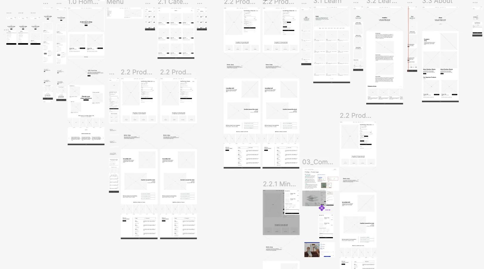
With the information architecture set, I made low-fidelity wireframes to explore the layout of key screens and how users would move through them. They allowed quick iterations and early feedback before any visual design.
[ outcome ]
Final designs
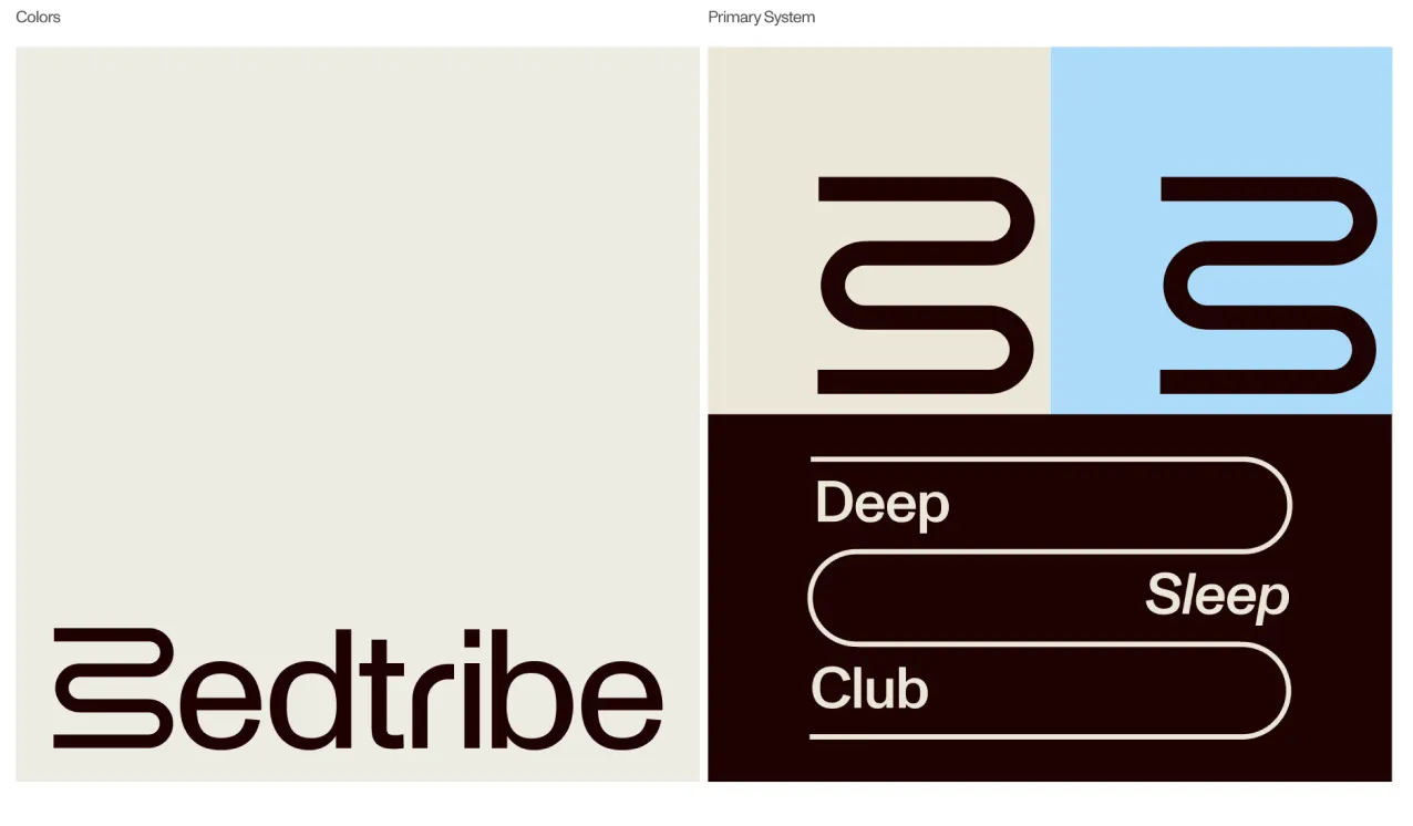
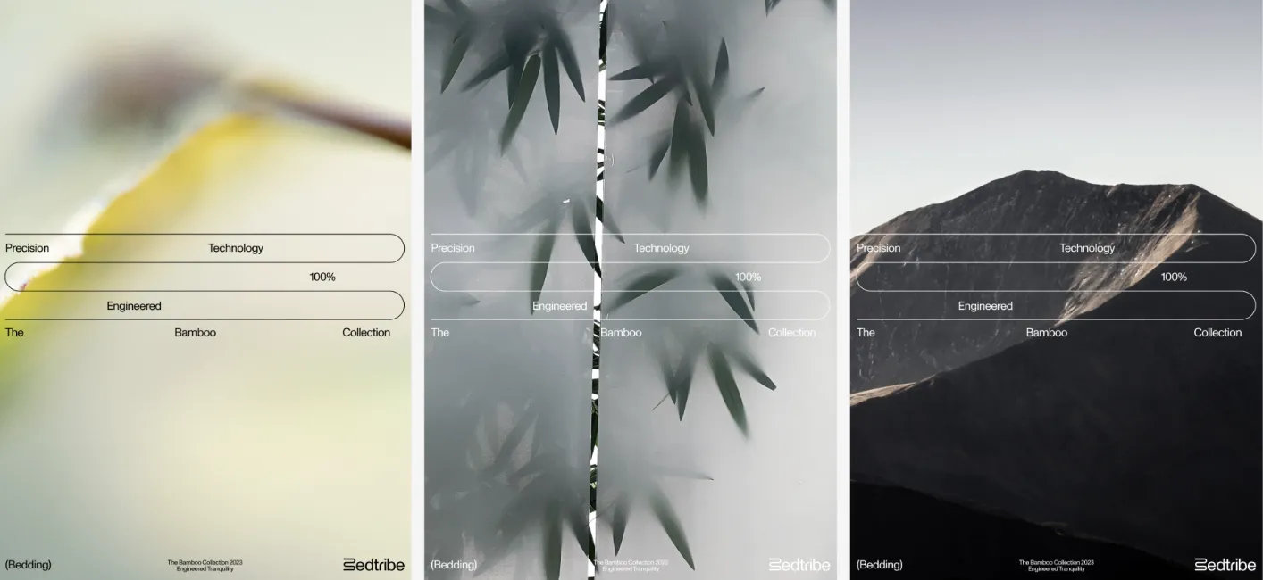
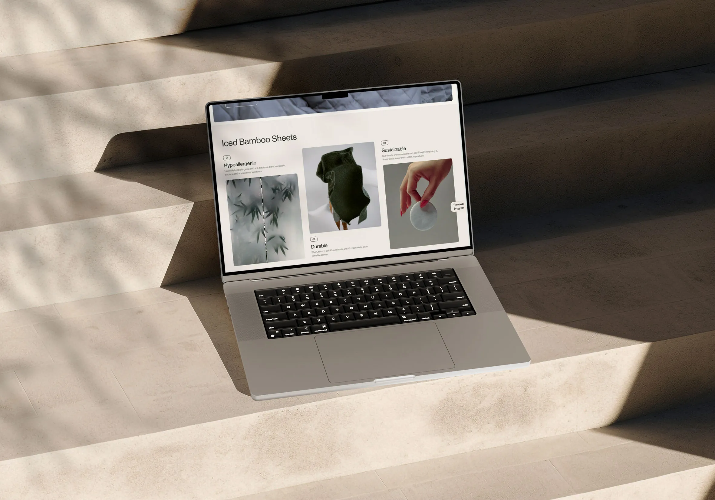
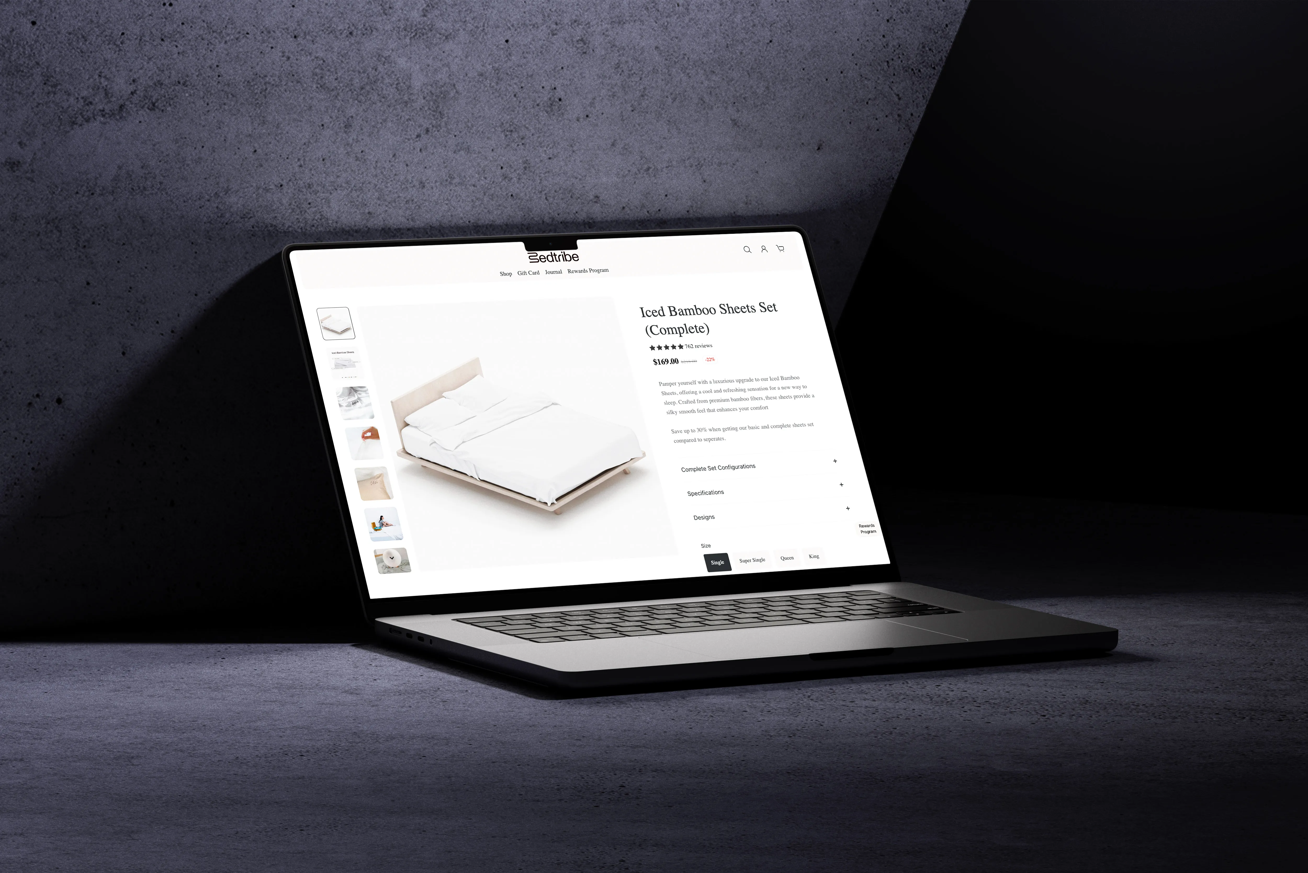
The new Bedtribe identity is a refreshed take on modern rest, where comfort meets innovation. The redesigned site showcases the key bamboo sheets more intuitively and reinforces the mission to make quality sleep accessible and affordable, with a calm visual language and clear storytelling.
A new look for the website
With the new branding, typography, colour and visual elements were updated across the site for a more cohesive and trustworthy experience.

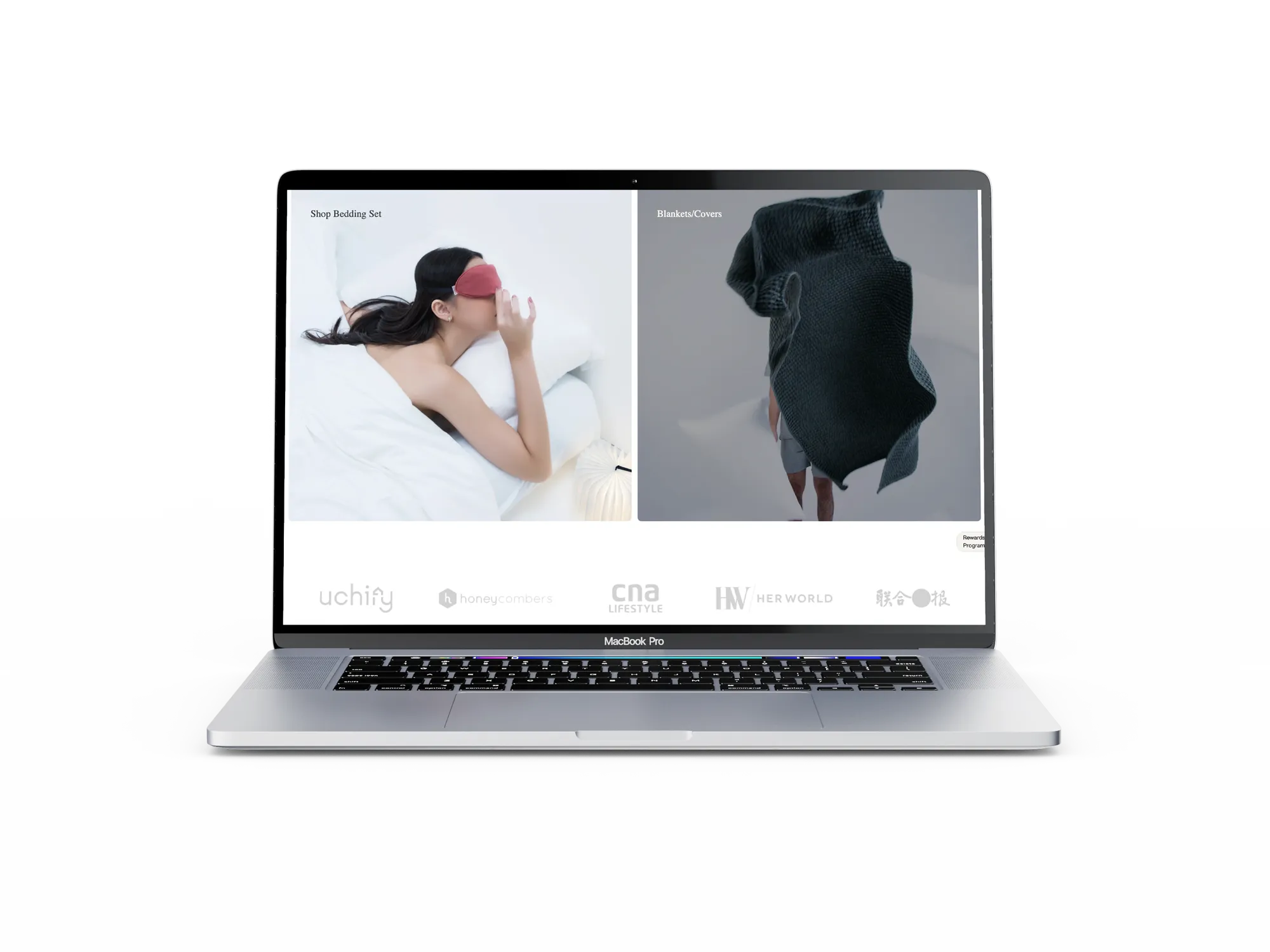
Trust-building elements
We added a media bar showing where Bedtribe has been featured, and product listing cards on the homepage for users to click into.
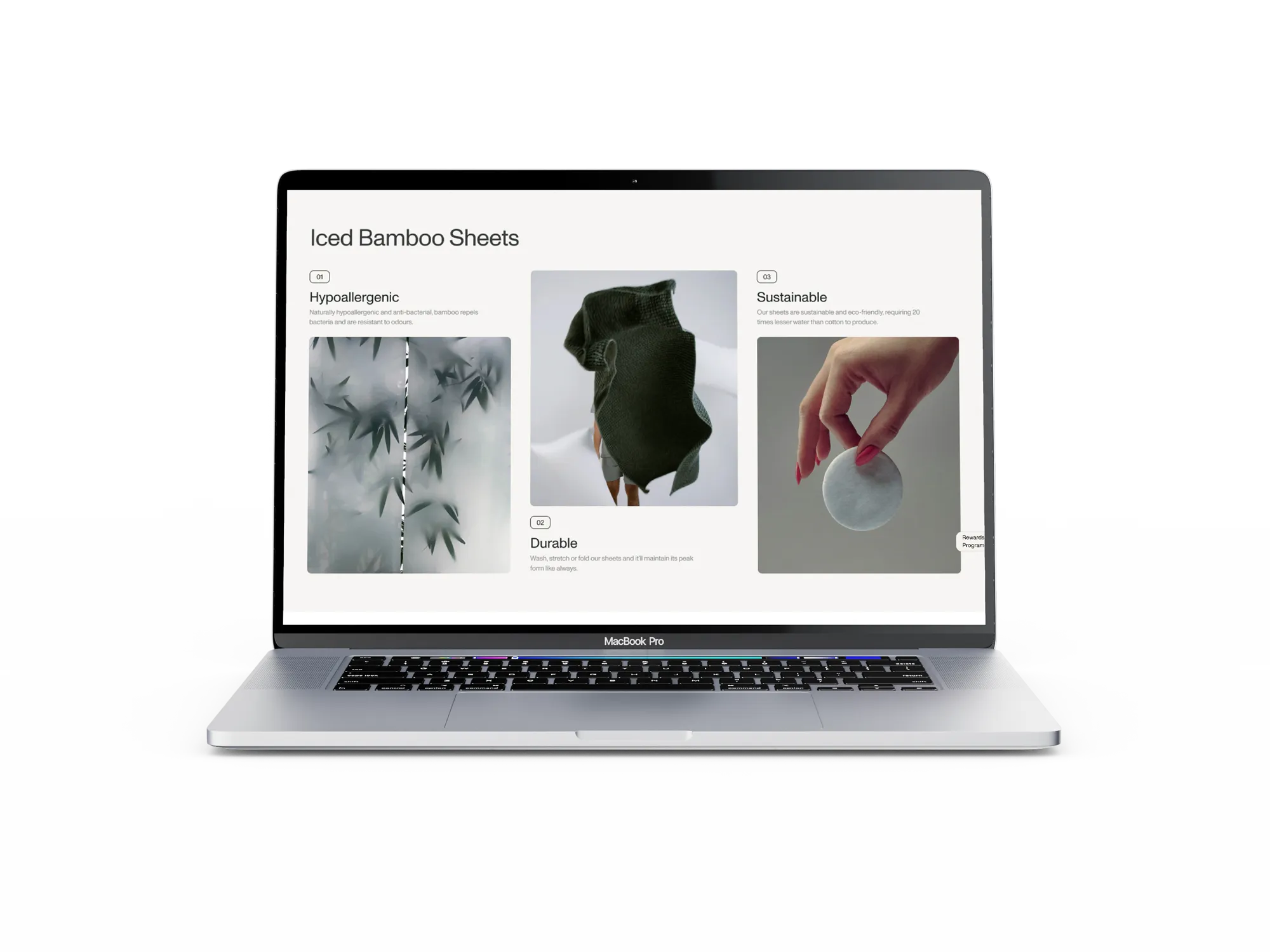
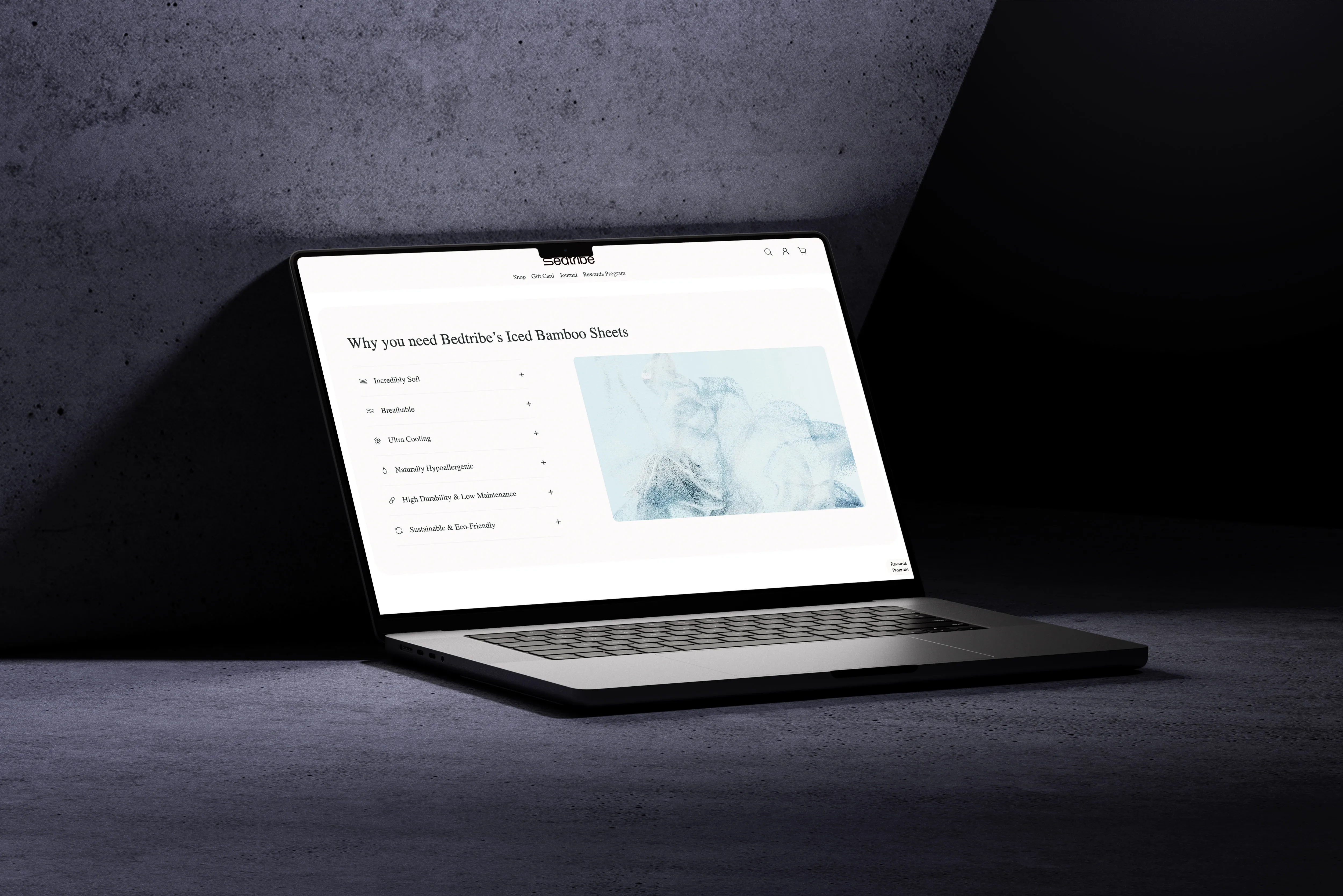
Surfacing the benefits of bamboo sheets
Based on the insights, we put key benefits on the homepage: hypoallergenic, durable and sustainable. Users get the important information without digging, and feel confident before they even reach a product page.
[ result ]
- +2.5%
- click-through rate on product listings
[ what i learned ]
This project taught me to navigate different priorities between user experience and business goals. I first proposed leading with the benefits of the bamboo sheets so users could decide with confidence, but the client wanted to showcase their product range to drive upselling. Through iteration and discussion, I learned to strike a balance: users still get the key information, and the business goals are supported.