MHR

Redesigning MHR Hotel’s Rate Card

ROLE

UX Designer

DURATION

5 WEEKS

CHECK OUT MHR WEBSITE

Background

When confusion costs trust, MHR turned to us for solutions

Guests had raised complaints about the rate card being confusing and difficult to interpret, which negatively affected satisfaction and bookings. Revamp key marketing asset by rethinking both content and design

The Challenge

Unclear rate labels and a long layout hindered comparison and transparency, leading to confusion during the booking process.

Business Need

Reduce booking friction and customer complaints by improving rate clarity and comparison.

User Need

Enable users to easily compare rates and understand refund conditions at a glance.

Current Design

No clear indicators or labels that that a rate
was non-refundable. Users could only find
this information buried within the cancellation
policy text. This resulted in confusion and
unhappy experience.

Approach

How might we simplify MHR Hotel's rate display to help guests easily differentiate between non-refundable and flexible rates?

Insights from competitor analysis

To tackle the challenge, we began by analyzing competitor strategies to understand how leading hotel brands design their rate displays. By benchmarking against industry standards, we identified key practices, such as intuitive labeling, side-by-side comparisons, and the strategic use of visual cues. These insights shaped our approach to crafting a simplified and user-friendly rate card that addressed MHR Hotel's specific pain points while aligning with guest expectations for clarity and transparency.

Compare

IHG’s side-by-side
3 column layout makes
rate comparison easy at
a glance, reducing
scrolling and enhancing
booking efficiency.

Use Icons

Clear icons create a strong visual hierarchy, helping users quickly scan and understand key rate information without cognitive overload.

Reduce clutter

A lightbox overlay presents rate details in a focused view, reducing page clutter and allowing users to access information without losing context.

Client's concern

The client wanted to clearly highlight refundable rates without overshadowing the benefit of free member bookings.

Final Designs

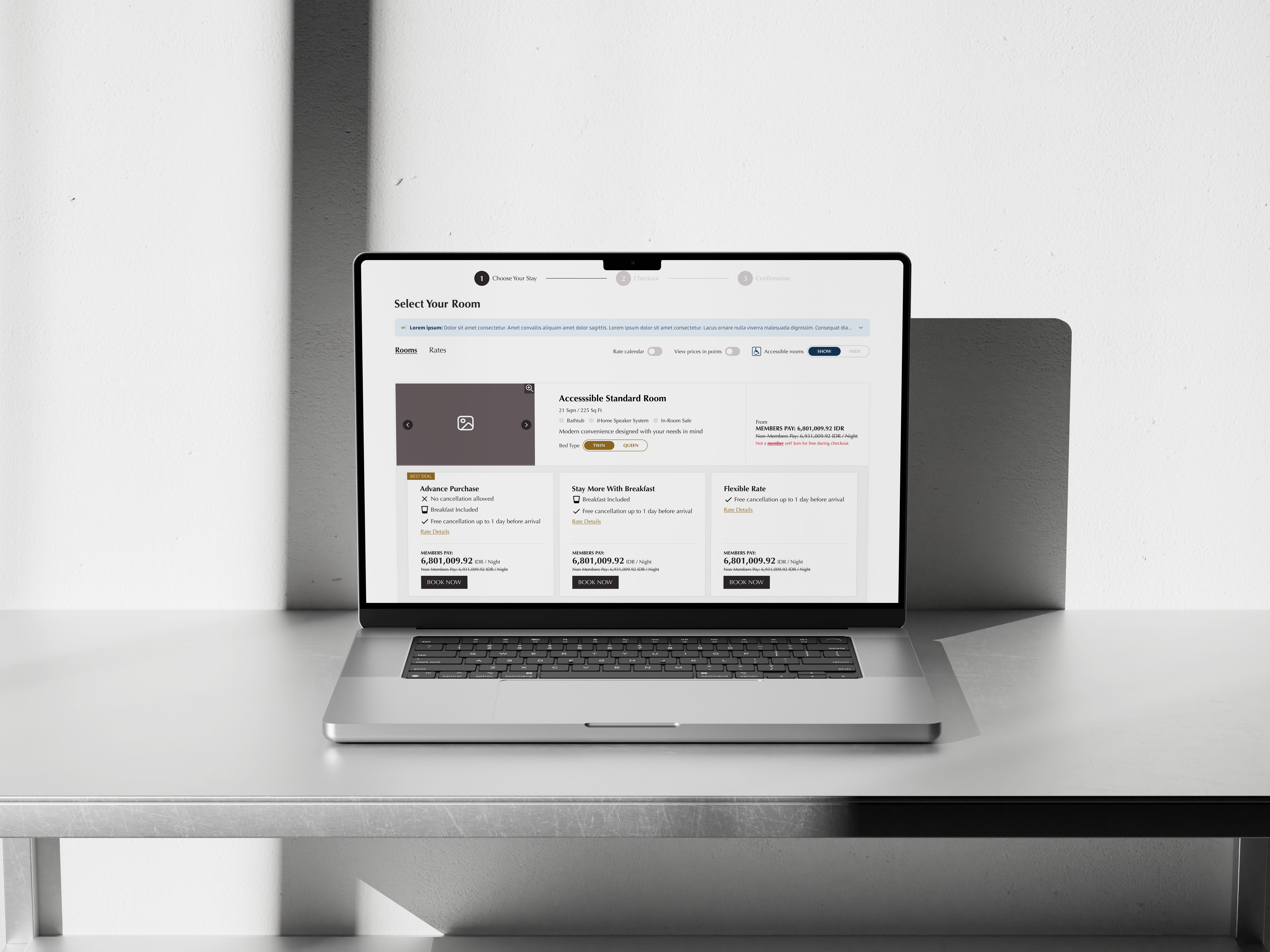
Showing member rates first, without confusing refundable options

01

To address the client’s concern about highlighting free booking for members, we ensured that member rates were prominently displayed first on the rate cards. A 3 col layout is also applied to allow users to compare prices easily.

02

The original price was shown with a strikethrough, emphasizing the reduced member rate. This visual hierarchy guided users toward the preferred action, encouraging them to sign up or log in to secure the best deal.

03

Rate details are hidden in an accordion to maintain a clean, concise layout. Users can expand sections to view more details as needed, avoiding visual clutter.

Side by side comparison

Before re-design

After re-design

Outcome

+2.5%

Increase in customer's satisfaction

What I learned from this project

I learned the importance of having clear objectives for each iteration.
At times, shifting goals caused inefficiencies. Moving forward, I’ll ensure that every decision is tied to
specific user or business outcomes for better clarity and direction.